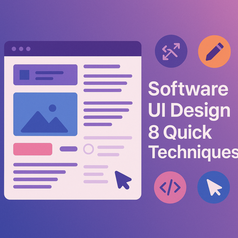
Software UI Design: 8 Quick Techniques
Getting software UI design right is one of the most impactful investments a business can make in 2026. A well-designed interface reduces training time, keeps users engaged, and directly supports productivity goals. Yet many custom software projects treat the user interface as an afterthought rather than a core deliverable. This article walks through 8 quick, practical techniques that help development teams and business owners build interfaces that actually work for real people every single day.
- Understand Your Users First
- Consistency Matters More Than You Think
- Software UI Design and Visual Hierarchy
- Build in Feedback and Response Cues
- Custom UI Design Tips for Business Software
- Simplifying the Business Software Interface
- User Interface Best Practices for 2026
- Software UI Design Testing and Iteration
- Frequently Asked Questions
- Wrapping It All Up
Understand Your Users First
No software UI design technique matters if you do not understand who is actually using the product. Before writing a single line of CSS or placing a single button, spend real time with the end users. Watch them work. Ask them about their daily frustrations. Find out what they do ten times a day versus once a month.
Many teams skip this step and design interfaces based on assumptions. The result is usually a polished-looking product that people quietly hate using. User research does not need to be expensive or complicated. Even a handful of structured interviews can reveal patterns that reshape the entire design direction.
- Conduct short user interviews before any wireframing begins
- Observe real workflows rather than relying only on written requirements
- Create simple persona profiles to keep design decisions grounded
- Ask about pain points with any current tools already in use
Understanding users early also helps prioritize which screens need the most design attention. High-frequency screens deserve far more polish than rarely visited settings pages.
Consistency Matters More Than You Think
Consistency is one of the most underrated elements of strong software UI design. When buttons look the same, labels use the same terminology, and layouts follow predictable patterns, users learn the system faster and make fewer mistakes. Inconsistency creates cognitive friction, and cognitive friction kills productivity.
In 2026, design systems have become a standard approach for maintaining consistency across large custom software projects. A design system is essentially a shared library of components, colors, typography rules, and interaction patterns that every screen draws from.
Building a Simple Component Library for Software UI Design
You do not need a massive design system from day one. Start with a small component library that covers the most common elements: buttons, form fields, data tables, modals, and navigation menus. Establish rules for spacing, font sizes, and color usage. Document these rules somewhere the whole team can reference.
- Define primary, secondary, and danger button styles clearly
- Standardize form field labels and error message formats
- Use the same icon set throughout the entire application
- Agree on a spacing scale and stick to it across all screens
Consistency also applies to language. If one screen says “Save” and another says “Submit” for the same action, users notice and lose trust in the system.
Software UI Design and Visual Hierarchy
Visual hierarchy is how you guide users’ eyes to the most important elements on a screen without them having to think about it. In software UI design, hierarchy is achieved through size, color, weight, contrast, and spacing. When done well, users naturally flow from the most important action to supporting information without conscious effort.
A common mistake in business software is treating everything as equally important. When every element on a screen competes for attention with the same size and color, users freeze. They spend mental energy figuring out where to start instead of doing their actual work.
- Make the primary action button the most visually prominent element
- Use lighter colors and smaller font sizes for secondary information
- Group related items together with whitespace to separate unrelated ones
- Avoid using more than two or three font sizes on a single screen
Hierarchy also signals trust. A cluttered, flat interface feels overwhelming. A well-structured one feels professional and reliable, which matters a lot in business software contexts.
Build in Feedback and Response Cues
Users need to know that the system heard them. When someone clicks a button, submits a form, or triggers a process, the interface should immediately communicate what happened and what comes next. This is called feedback, and it is one of the most powerful elements in any software UI design strategy.
Feedback can be as simple as a button changing color when clicked, or a loading spinner appearing during data retrieval. It can also be more detailed, like a success toast notification confirming a record was saved, or an inline error message explaining exactly what went wrong in a form field.
- Use loading indicators for any action that takes more than half a second
- Show success messages after form submissions and record saves
- Display inline validation errors next to the specific field with the issue
- Confirm destructive actions like deletions with a clear warning prompt
Good feedback reduces support tickets. When users understand what the system is doing, they feel in control and are less likely to submit a help request or repeat an action accidentally.
Custom UI Design Tips for Business Software
Custom business software has different UI requirements than consumer apps. Users are typically trained professionals who use the tool for hours every day. This changes the design calculus significantly. Speed and efficiency matter far more than visual novelty. The best custom UI design tips for business contexts focus on reducing clicks, enabling keyboard navigation, and surfacing the right data at the right time.
Dashboards are a great example. A well-designed business dashboard shows the exact metrics a user needs for their role without requiring them to dig through menus. Role-based views mean a sales manager sees pipeline data while a support agent sees ticket queues, both from the same underlying system.
Prioritizing Efficiency in Custom UI Design Tips
- Enable keyboard shortcuts for high-frequency actions
- Use smart defaults to pre-fill fields based on context or history
- Build role-based views that surface relevant data automatically
- Minimize the number of clicks needed to complete common tasks
It is also worth thinking about how software UI design connects with broader software development decisions. Teams that invest in solid software requirement gathering before the design phase build interfaces that actually match how the business operates, rather than guessing and revising later.
Well-crafted interfaces also support smoother software user adoption, because people are far more willing to embrace a new system when it feels intuitive from the first session rather than confusing and intimidating.
Simplifying the Business Software Interface
The best business software interface is often the simplest one. Simplicity does not mean stripping out features. It means organizing features so users can find what they need without hunting through deep menus or remembering obscure navigation paths. Progressive disclosure is a technique that keeps things simple by hiding advanced options until they are actually needed.
Think of a settings panel. A beginner needs basic options. An advanced user needs fine-grained controls. Progressive disclosure shows the basic options first and reveals more only when the user explicitly asks for them. This keeps the interface clean for most users without limiting power users.
- Use progressive disclosure to hide advanced settings behind an expandable section
- Consolidate rarely used features into a single advanced or more options area
- Use contextual menus that appear only when relevant to the current task
- Audit existing screens for elements that users rarely interact with and remove or relocate them
Simplifying the interface also speeds up onboarding. New users are far less overwhelmed when they see only what they need to do today, with more complexity available when they are ready for it.
User Interface Best Practices for 2026
The landscape of user interface best practices has shifted noticeably in 2026. AI-assisted design tools now help teams generate layout options faster, but the fundamental principles remain human-centered. Accessibility has moved from a nice-to-have to a genuine business requirement. WCAG 2.2 compliance is increasingly expected by enterprise clients and required in public sector procurement.
Dark mode support, responsive layouts that work across desktop and tablet, and high-contrast mode options are now baseline expectations for serious custom software projects. Teams that skip these basics are building technical debt into the interface layer from the start.
- Meet WCAG 2.2 AA contrast ratios for all text and interactive elements
- Design for keyboard-only navigation from the beginning, not as an afterthought
- Test layouts on at least two screen sizes before any release
- Offer dark mode or respect the user’s operating system preference
Accessibility resources from organizations like the W3C Web Accessibility Initiative provide detailed, up-to-date guidance on meeting these standards. Bookmark this early in any project rather than scrambling to retrofit compliance later.
Strong user interface best practices in 2026 also mean designing with data privacy in mind. Only surface the data a user needs for their role. Avoid showing sensitive information in screens that might be visible in shared spaces.
Software UI Design Testing and Iteration
Even the most thoughtful software UI design needs testing with real users before it is considered finished. Usability testing does not require a formal lab or a large budget. It can be as simple as sitting with five users, giving them a set of tasks, and watching where they hesitate or struggle. Those friction points are your next design priorities.
In 2026, remote usability testing tools have made it easier than ever to collect screen recordings, click heatmaps, and session replays from actual users in their natural work environment. This data is far more valuable than internal assumptions about how people will behave.
- Run usability tests before finalizing any major screen or workflow
- Focus on task completion rates rather than subjective opinions alone
- Use heatmap data to identify overlooked or frequently missed elements
- Treat every release as a hypothesis, measure it, and iterate based on findings
Good testing habits also tie directly into the value of automated testing for custom software at the functional level. When both functional and usability testing are built into the development rhythm, quality compounds over time rather than degrading with each new release.
Iteration is not a sign of failure. It is the mechanism through which good software UI design gets great. Build in time for at least one round of usability testing before any major launch and treat the findings as a gift rather than a setback.
Frequently Asked Questions
What is software UI design and why does it matter for business software?
Software UI design refers to the process of creating the visual and interactive elements of a software application, including layouts, buttons, navigation, forms, and data displays. For business software, it matters enormously because employees use these tools for hours every day. A poorly designed interface increases errors, slows down workflows, raises training costs, and drives low adoption rates. A well-designed interface does the opposite, making work feel faster, clearer, and less stressful for the people who depend on it.
How is designing a business software interface different from designing a consumer app?
Consumer apps prioritize first impressions and emotional appeal because they need to attract and retain users who have many alternatives. Business software interfaces prioritize efficiency, data density, and reliability because users are professionals completing specific tasks under time pressure. Business users typically have more tolerance for complexity if it means getting their job done faster. However, this does not mean business interfaces can be ugly or confusing. Clarity, speed, and error prevention are the top priorities in any strong business software interface.
What are the most common mistakes in software UI design for custom projects?
The most frequent mistakes include skipping user research, treating the interface as a final-phase task rather than a core design concern, inconsistent use of components and terminology, missing feedback cues after user actions, and ignoring accessibility requirements. Many teams also over-design early screens while under-designing the complex data-heavy screens that users interact with most frequently. Starting with the highest-frequency workflows and testing them with real users before polishing secondary screens is a much more effective approach for custom software projects.
How many rounds of testing should a software UI design go through before launch?
There is no fixed number, but a minimum of two rounds is a reasonable target for most custom business software projects. The first round should happen early, ideally on wireframes or low-fidelity prototypes, to catch fundamental structural problems before expensive visual design work is completed. The second round should happen on a near-final build to catch interaction and usability issues that only appear with real data and real workflows. For high-stakes enterprise software, additional rounds are always worthwhile and typically pay for themselves in reduced post-launch support costs.
What accessibility standards apply to software UI design in 2026?
WCAG 2.2 is the most widely referenced accessibility standard in 2026, and the AA conformance level is considered the baseline expectation for professional business software. Key requirements include sufficient color contrast ratios between text and backgrounds, full keyboard navigability for all interactive elements, meaningful alternative text for images and icons, and clear focus indicators for keyboard users. Many enterprise procurement contracts now explicitly require WCAG 2.2 AA compliance, and public sector software projects often have legal obligations to meet these standards across all jurisdictions.
Wrapping It All Up
Software UI design is not a cosmetic layer applied at the end of a project. It is a strategic discipline that shapes how effectively people can do their work using the tools you build for them. The 8 techniques covered here, from understanding users deeply to testing and iterating with real data, give any team a practical foundation for building interfaces that earn lasting trust.
The best custom business software in 2026 is the kind that people actually want to use because it respects their time, communicates clearly, and helps them accomplish their goals without unnecessary friction. Start with users, stay consistent, and keep testing. That formula works every time.